CASE STUDY · MENTAL HEALTH PLATFORM · 2024 / 2026

If people are going to spend hours online anyway, let it be somewhere that takes care of them.
- My role
- Product Designer
- Year
- 2024 (v1) · 2026 (v2)
- Team
- Solo project
- Platform
- Web 1440 + mobile 390
01 · PROJECT OVERVIEW
A calmer place to spend your time
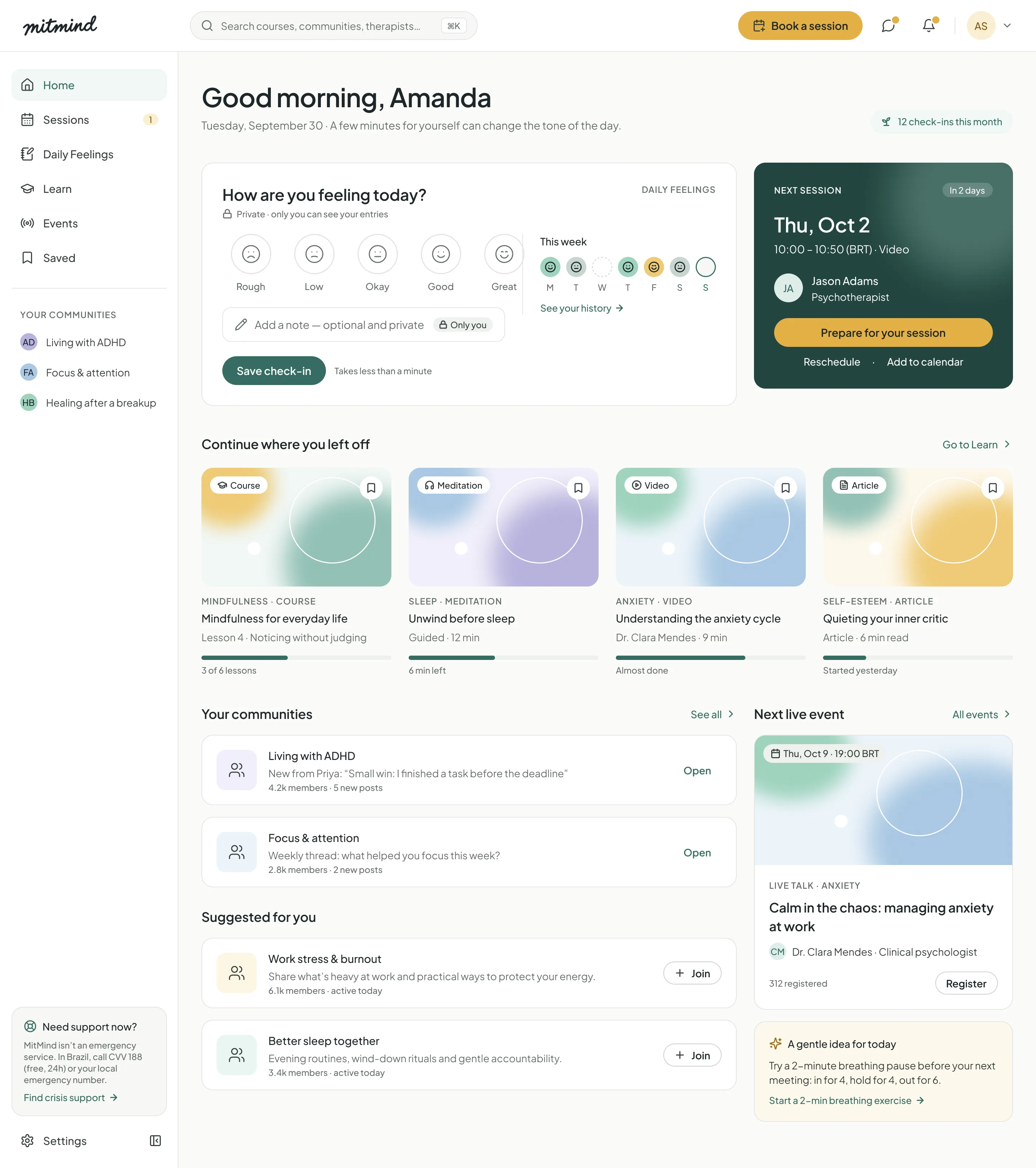
MitMind is a mental health platform concept I created. It brings together sessions with licensed psychologists, a private mood journal called Daily Feelings, short courses and meditations, moderated communities and live talks.
I designed the first version in 2024. In 2026 I came back to it with more experience and redesigned it from zero: new research, care principles, a complete design system and 67 screens for desktop and mobile.
The core challenge: a person in therapy has about 4 hours of contact with a psychologist per month. MitMind is designed for the rest of the month, in a way that feels safe, private and never judges how someone feels.
What I delivered
- 67High-fidelity screens58 desktop and 9 mobile, including empty, loading and error states
- 60+Components36 variant sets, all bound to variables and text styles
- 130Design tokensPrimitives, semantic colors and dimensions, with a WCAG check
- 7Prototype flowsFrom onboarding to booking, sharing and live events
My role & tools
Solo project. I was responsible for the full product design: research, information architecture, care and privacy rules, UX writing, the design system and every screen. I worked like I do with product teams: understand the problem, set principles, build the system, then design the flows.
- UX Research
- Heuristic Audit
- Information Architecture
- UX Writing
- UI Design
- Design System
- Prototyping
- Accessibility
- Figma
Project timeline
- 2024Version 1First concept: home, Daily Feelings, communities and sessions.
- 2026 · Phase 1Research & auditDesk research, heuristic audit of v1 and care principles.
- 2026 · Phase 2Design systemFoundations, 130 tokens and more than 60 components.
- 2026 · Phase 3Screens & flows67 screens, states, mobile and 7 clickable flows.
02 · RESEARCH
Understanding the space between sessions
I started from public data about mental health and screen time in Brazil, then audited my own first version with a more critical eye.
The context in numbers
- 5%of people in Brazil are in psychotherapy
- 9h32online per day on average in Brazil (global average: 6h58)
- ~4 hof contact with a psychologist per month, for people in weekly therapy
Research methods
- Desk researchPublic dataNumbers about access to therapy and time spent online in Brazil, to understand the size of the gap.
- AuditHeuristic review of v1I reviewed every v1 screen with Nielsen's 10 heuristics and asked one more question: does this feel safe for someone on a bad day?
- BenchmarkCompetitive analysisTherapy platforms, meditation apps and online communities. Each one solves one part of the problem, none connects them.
- GuidelinesCare & accessibilitySafe messaging guidelines for suicide prevention, the CVV 188 support line in Brazil and WCAG 2.2 AA.
Key insights
- 01The weeks between sessions are emptyTherapy happens in one hour a week. The thoughts, bad days and small wins happen in the other 167 hours, and people forget most of them before the next session.
- 02Emojis and red judge feelingsv1 used cartoon emojis, including a crying face for "Super Sad". In a mental health context, this turns a low day into something that looks wrong or embarrassing.
- 03Privacy is the condition for honestyPeople only write the truth in a journal if they control who reads it. Sharing with a therapist has to be explicit, limited and easy to stop.
- 04Help must be one tap awayv1 had no path for a crisis. A mental health product needs to say clearly what it is not, and show where to find urgent help from any screen.
Proto-personas
Fictional people built from the research, used to guide decisions. They are assumptions to validate in usability tests, not interview results.
- Amanda Smith, 34Marketing Manager · São Paulo
- In weekly therapy
- Busy schedule
Started therapy last year. Long workdays and many hours on her phone. She wants to keep the progress from her sessions alive during the week.
Goal
Notice patterns in her mood and bring them to therapy.
Frustration
Wellness apps that feel like homework or punish her for missing a day.
“By Thursday I can't remember how Monday really felt.”
- Jason Adams, 41Psychotherapist · Remote
- Licensed psychologist
- Online sessions
Sees most of his clients by video. He values context, but he is careful about tools that collect more client data than needed.
Goal
Start each session with context, without asking clients to fill forms.
Frustration
Platforms where consent is unclear or data is shared by default.
“I only want to see what my client chose to show me.”
- Lucas Rocha, 22University student · Recife
- Never tried therapy
- Lives online
Spends most of his free time on social media. He has felt anxious for months but does not know where to start or how much therapy costs.
Goal
Understand what he feels and find affordable help.
Frustration
Feeling judged, or that his problem is not serious enough.
“I don't even know if what I feel is enough to see someone.”
03 · IDEATION
Designing care into the product
I framed the problem as How Might We questions, then wrote care principles that every screen had to pass.
How might we
- HMW keep people supported in the weeks between therapy sessions?
- HMW help people log how they feel without making a low day look like failure?
- HMW let people share their journal with a therapist while keeping full control?
- HMW make urgent help easy to find without making the whole product feel clinical?
Voice & care principles
- 01Warm, never clinicalSay "a rough day", not "negative mood". No diagnosis words, no promises of cure.
- 02Private by defaultMood and journal data are visible only to the person. Every share is explicit, limited and revocable.
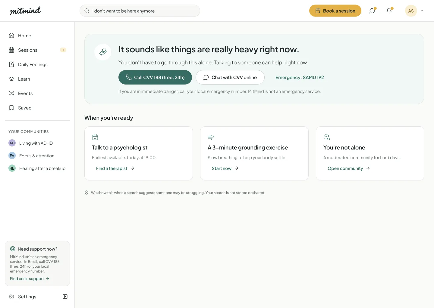
- 03Help is one tap awayCrisis support lives in the sidebar and footer. MitMind never presents itself as emergency care.
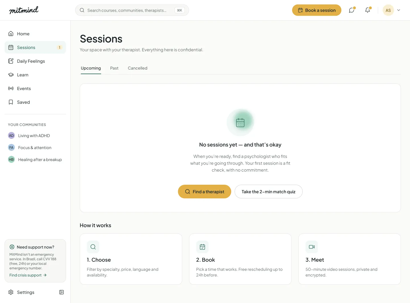
- 04No punishmentNo red for low moods, no streak shaming. Empty states invite, they don't scold.
- 05Calm hierarchyOne primary action per view, honey only for conversion, generous whitespace.
- 06AccessibleWCAG AA contrast, 40 px+ targets, focus rings and text labels next to every navigation icon.
Chosen concepts
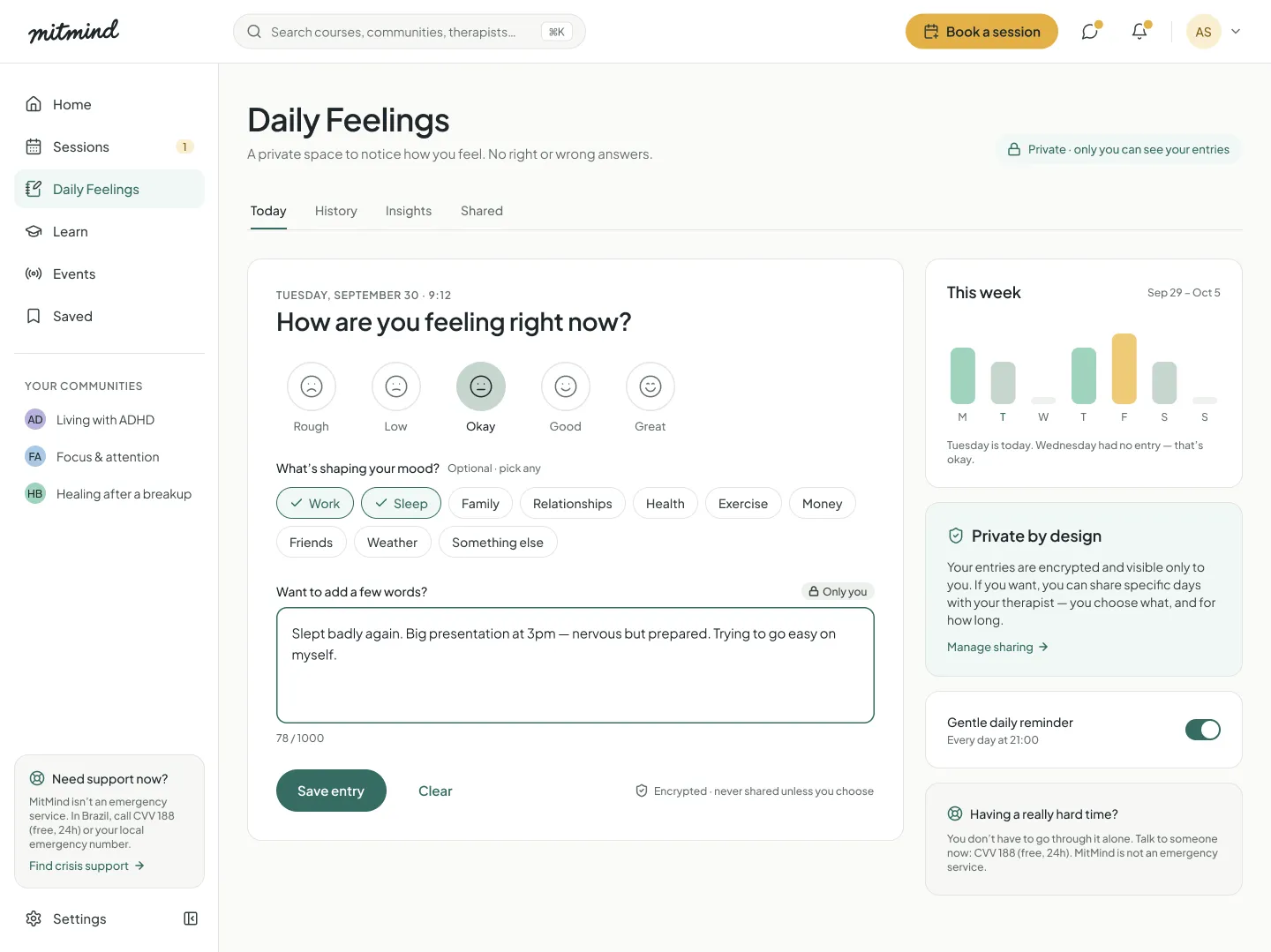
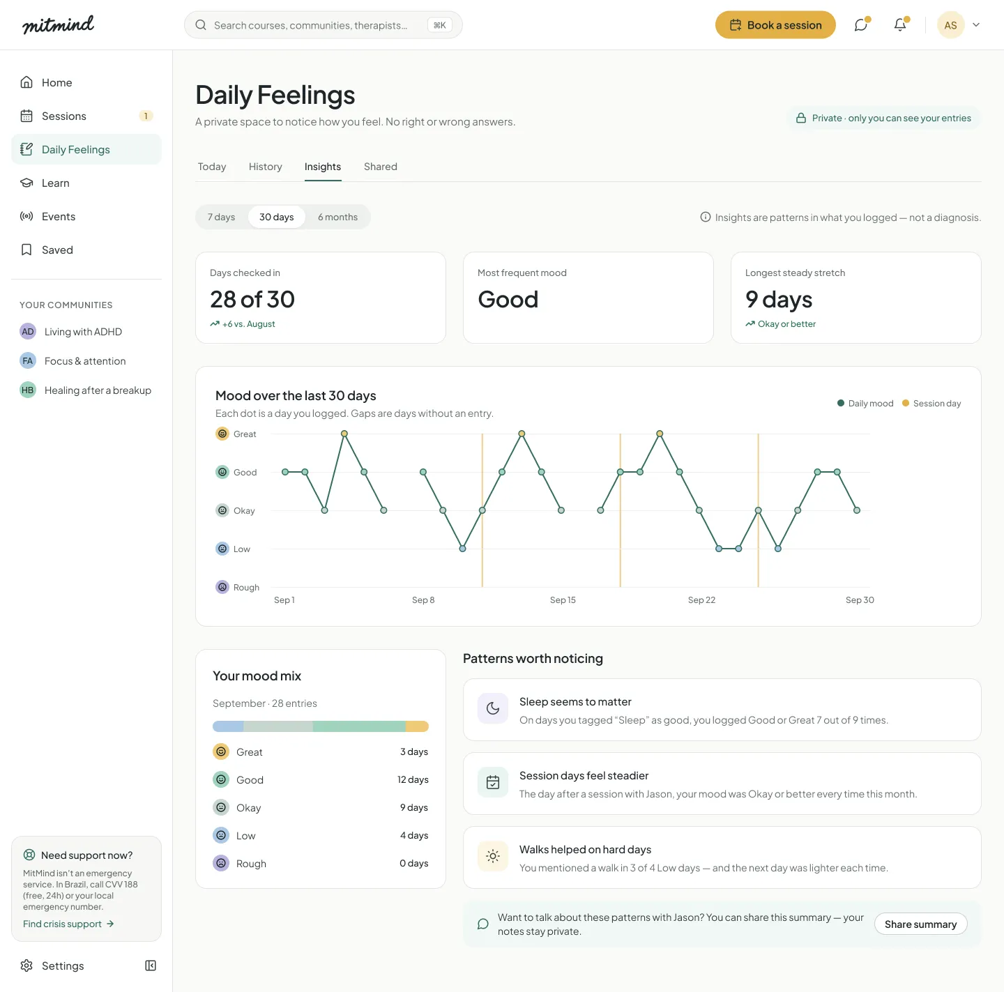
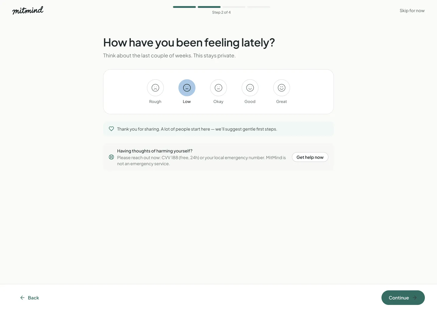
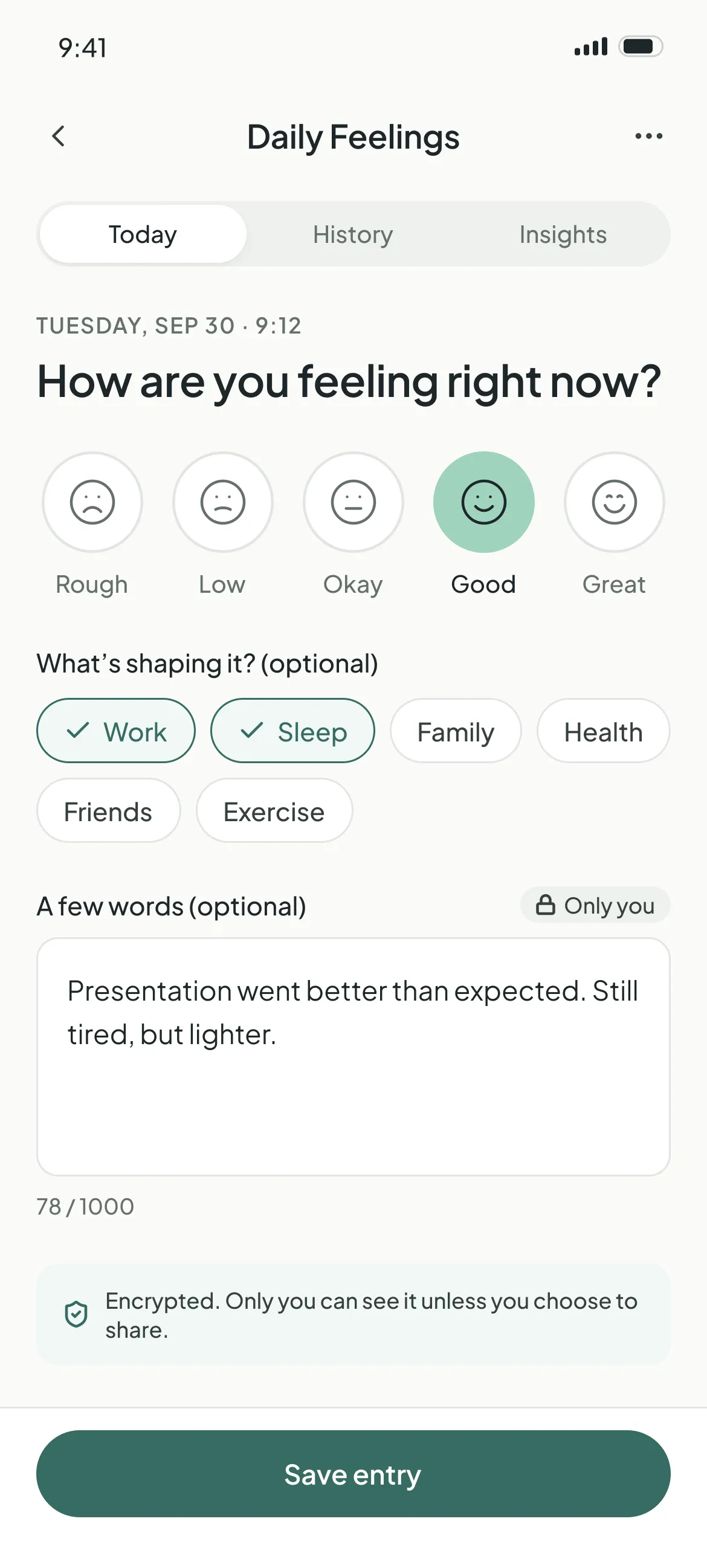
- Daily FeelingsA check-in that takes less than a minute: five custom mood faces, optional factors and a private note. History and insights show patterns, always with the reminder that they are not a diagnosis.
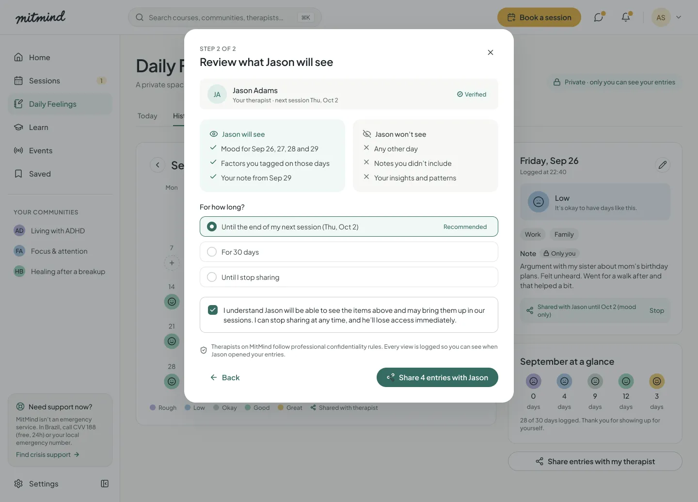
- Sharing with consentA two-step flow: choose the days, then review exactly what the therapist will and won't see, and for how long. Every view is logged and sharing can stop at any time.
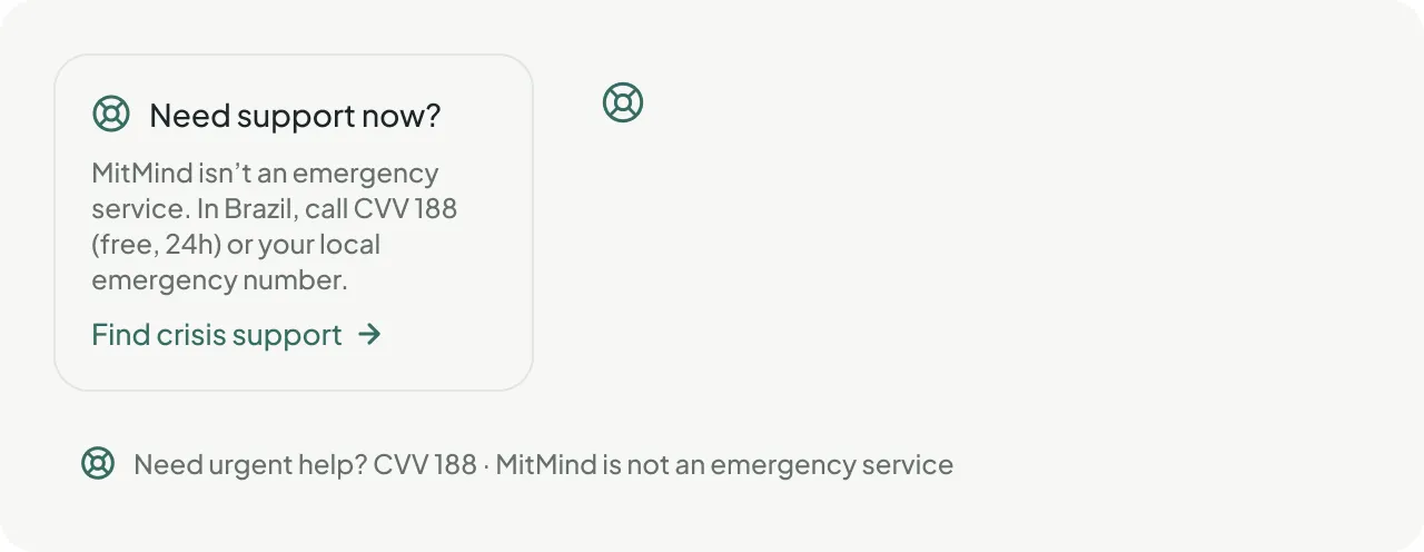
- Crisis support everywhereA calm card in the sidebar on desktop and in the footer on mobile, with CVV 188. When a search suggests someone may be struggling, MitMind shows support instead of results.
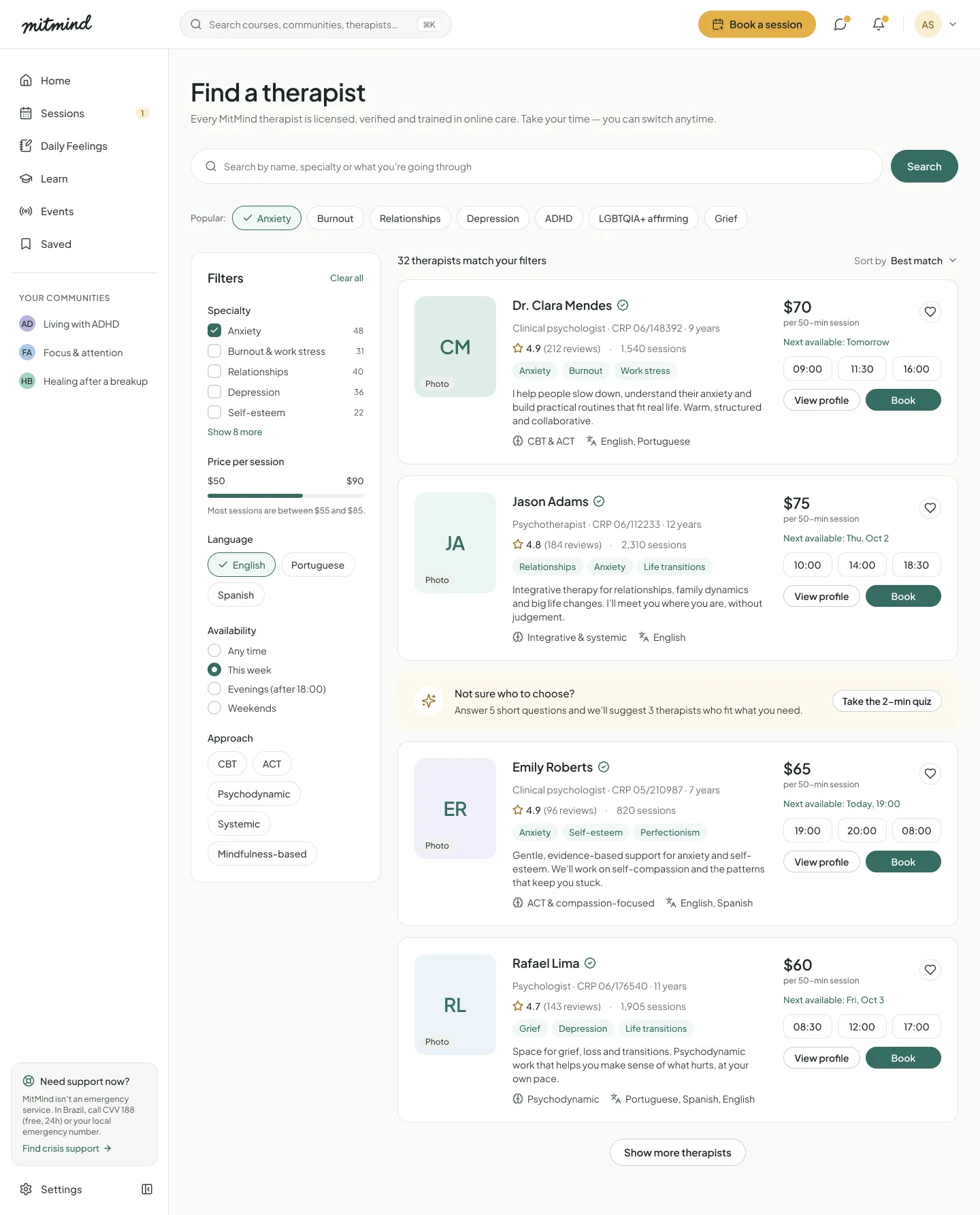
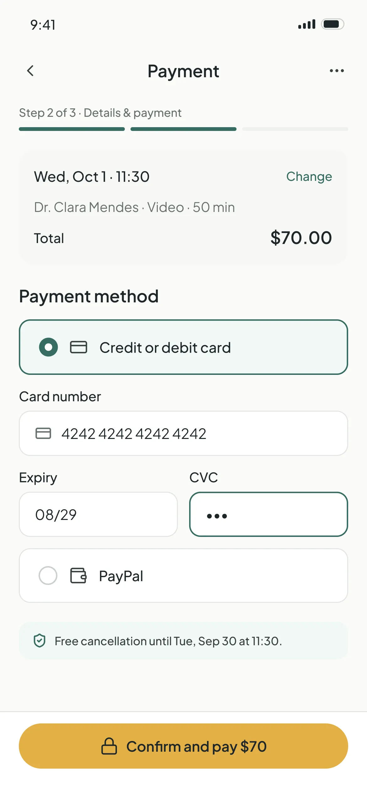
- Booking in four stepsFind a therapist, read the profile, choose a time and pay by card or PayPal. A clear payment error screen helps people recover without losing their slot.
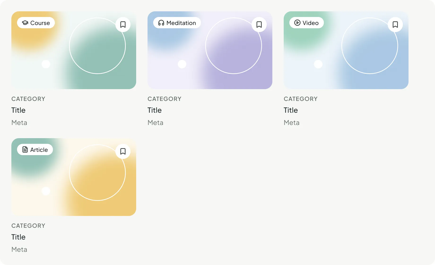
- Learn & live eventsShort courses, guided meditations, videos and articles, plus live talks with psychologists and their recordings. Progress is saved so people can continue where they left off.
- Moderated communitiesGroups around shared experiences, like living with ADHD or healing after a breakup, instead of a feed of people to follow.
04 · DESIGN
From system to screens
I compared v1 with what the research showed, built the design system and then designed every screen using only its components.
Before vs after
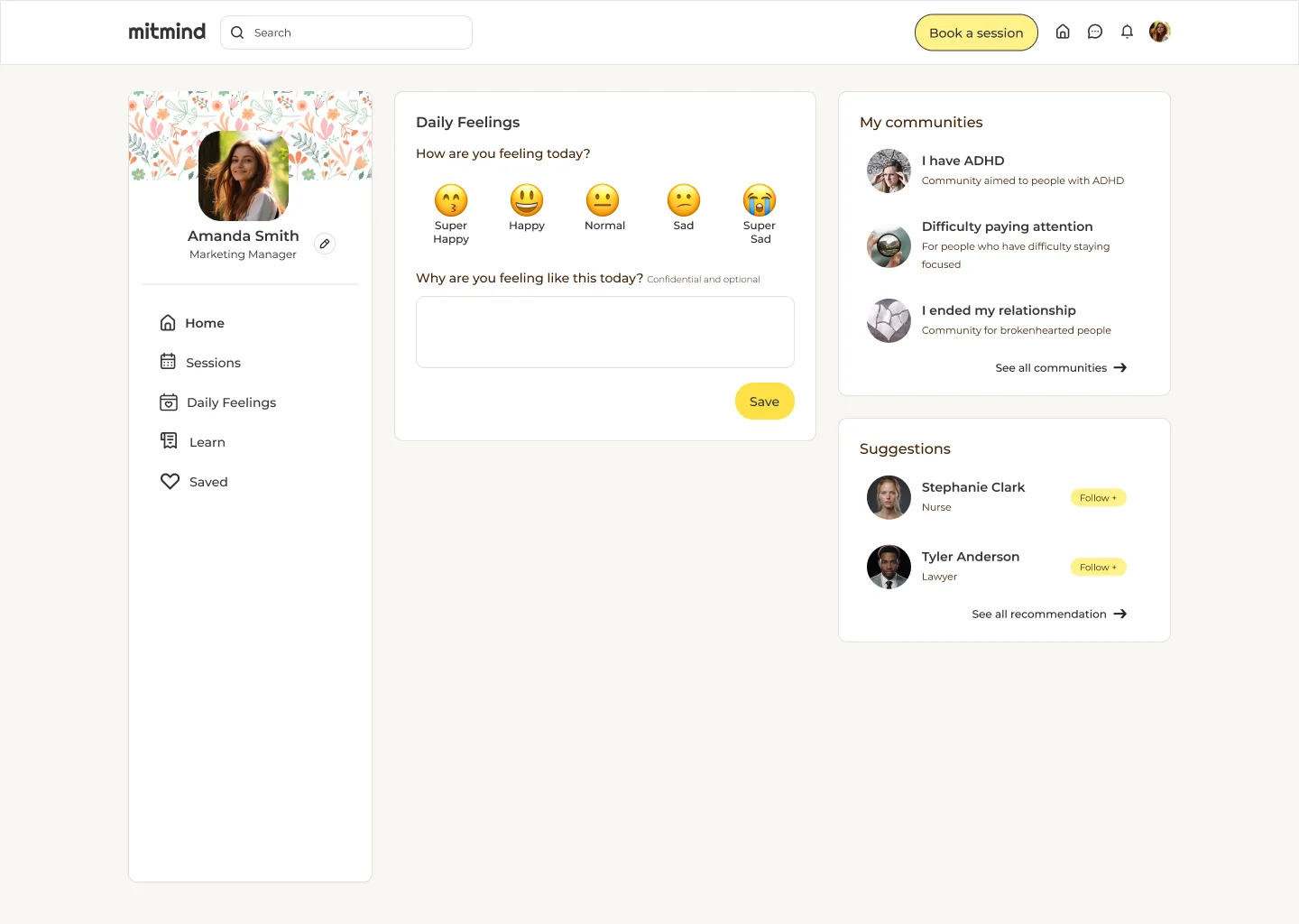
- Cartoon emojis for moods, including a crying face
- Bright yellow on every action
- Social layout with people to follow
- No crisis support and no privacy cues
- 5 pages: Home, Sessions, Daily Feelings, Learn, Saved
- Five custom mood faces, from cool to warm, never red
- Sage as the brand color, honey only for conversion
- One primary action per view and calm hierarchy
- Crisis support on every screen, "Private" labels on every entry
- 13 product areas, 67 screens, desktop and mobile
Visual foundations
Calm, trustworthy and human: a quiet interface that gives people room to breathe. Sage is the brand color (nature, balance, breathing), honey is a warm accent kept from the original yellow, and text is graphite instead of pure black. Plus Jakarta Sans gives a neutral UI that contrasts with the handwritten wordmark, with Lucide icons at 1.5 px.
Core palette
- Sage 600#356C62 · Primary action
- Sage 800#22453F · Highlight cards
- Sage 50#F1F7F5 · Brand subtle
- Honey 400#E3B146 · Conversion
- Graphite 900#1D2629 · Main text
- Neutral 25#FBFBF9 · App background
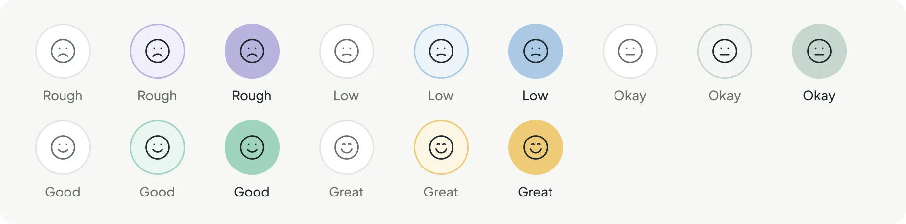
Mood scale
- Rough
- Low
- Okay
- Good
- Great
Five levels, from cool to warm. Low moods are never red, so they are never framed as failure.
Typography
A calmer place to spend your timePlus Jakarta Sans · Regular, Medium, SemiBold · body at 15/24 for comfortable readingDesign system
- Tokens130 variables. Primitive ramps feed semantic tokens like text/secondary or action/accent, and contrast is checked from the tokens themselves.
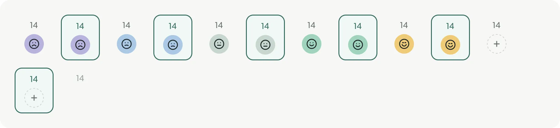
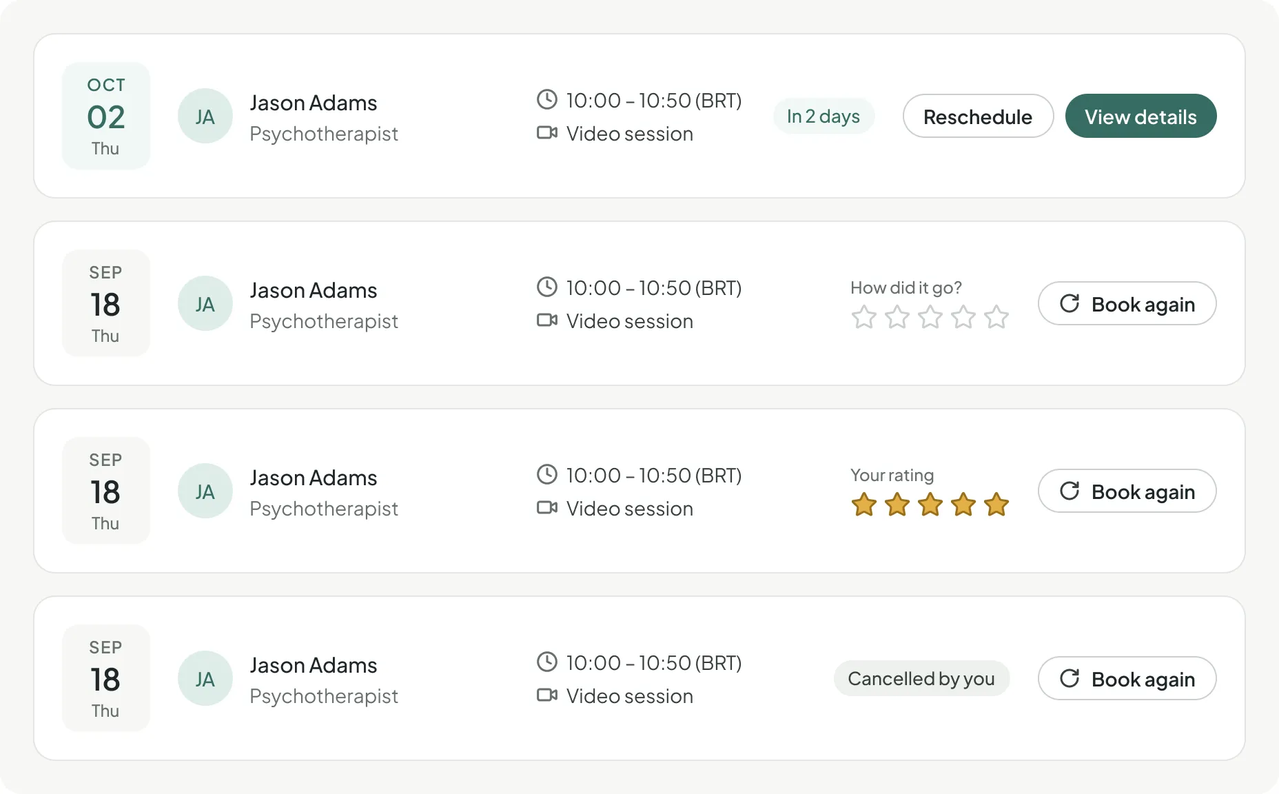
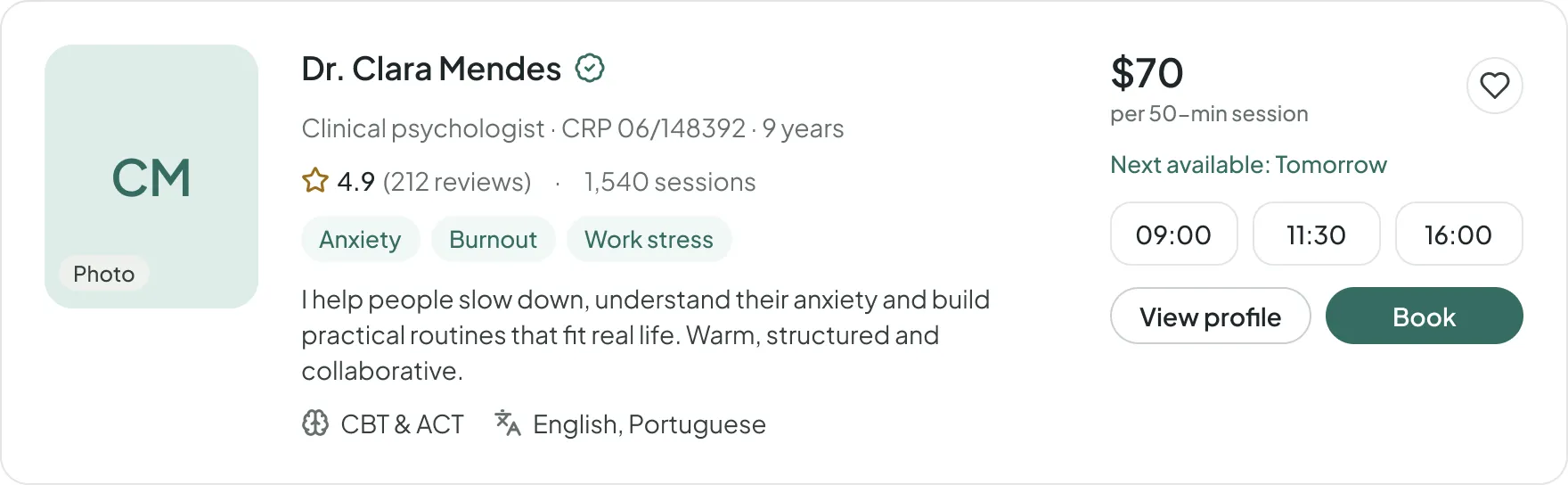
- ComponentsMore than 60 components in 36 variant sets: from buttons and inputs to mood options, session cards, therapist cards and payment options.
- Layout4 px base and 8 px rhythm. Desktop 1440: 72 px header, 248 px sidebar, 12 columns. Mobile 390: 4 columns with 20 px margins.
Components from the system
Key design decisions
- 01Never red for low moodsMood colors go from lavender to honey. Red is only used for real errors, like a failed payment, never for feelings.
- 02Privacy you can seeEvery journal surface shows "Private · only you can see your entries". The consent screen lists what the therapist will see and what they won't.
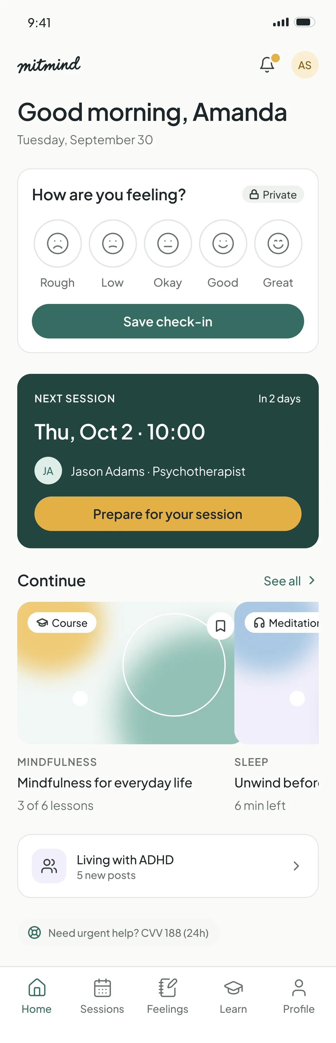
- 03Check-ins, not streaksThe home counts "12 check-ins this month" instead of a streak that breaks. Missing a day never resets anything.
- 04Honey means "do it"The warm accent is reserved for conversion, like Book a session. Everything else stays sage or neutral, so the page stays calm.
Prototype flows
- 1OnboardingWelcome, sign up, 4 questions, all set, home
- 2Home & navigationSidebar, header, notifications, profile menu, search
- 3Book a sessionFind, profile, time, checkout (card, PayPal, error), confirmed
- 4Daily FeelingsLog, history, share with consent, manage sharing
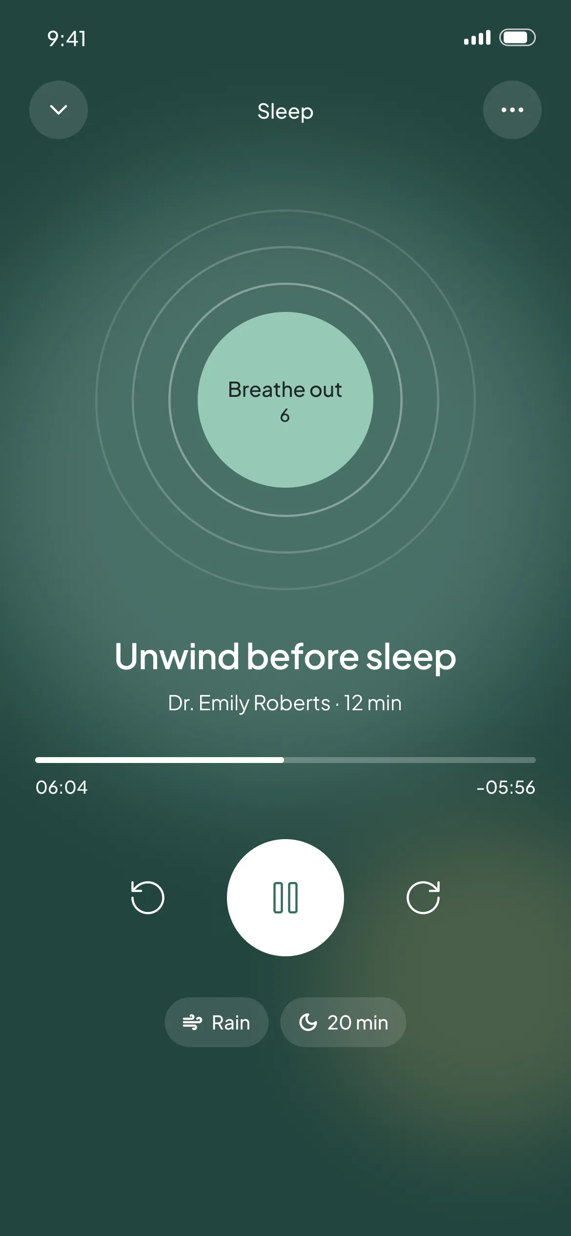
- 5LearnCatalog, course, video and meditation player
- 6EventsList, detail, live room and recording
- 7MobileHome, sessions, booking, feelings, learn, player
High-fidelity screens
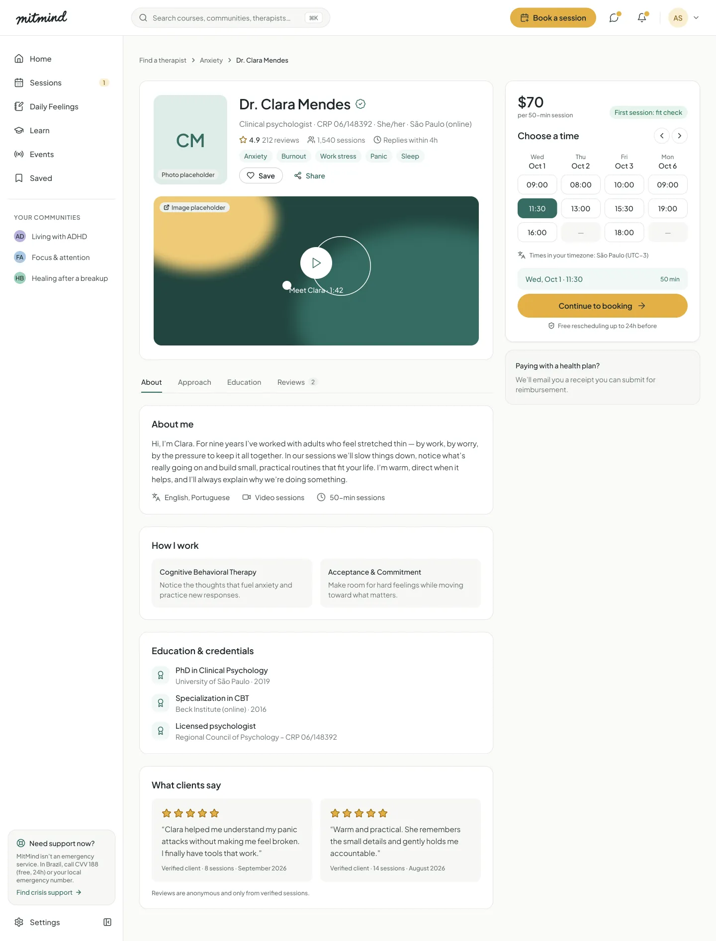
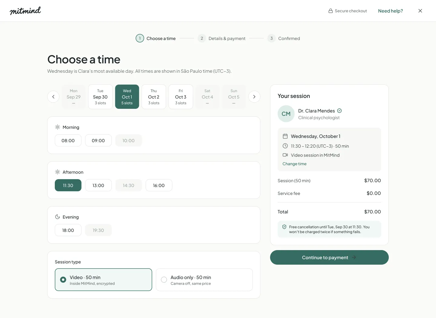
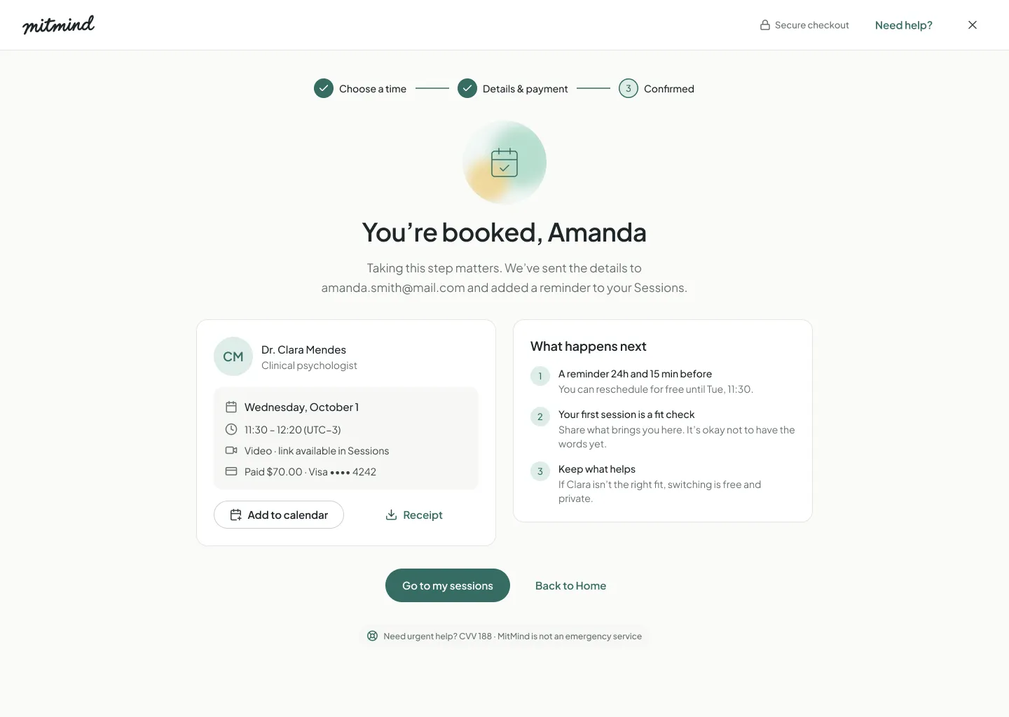
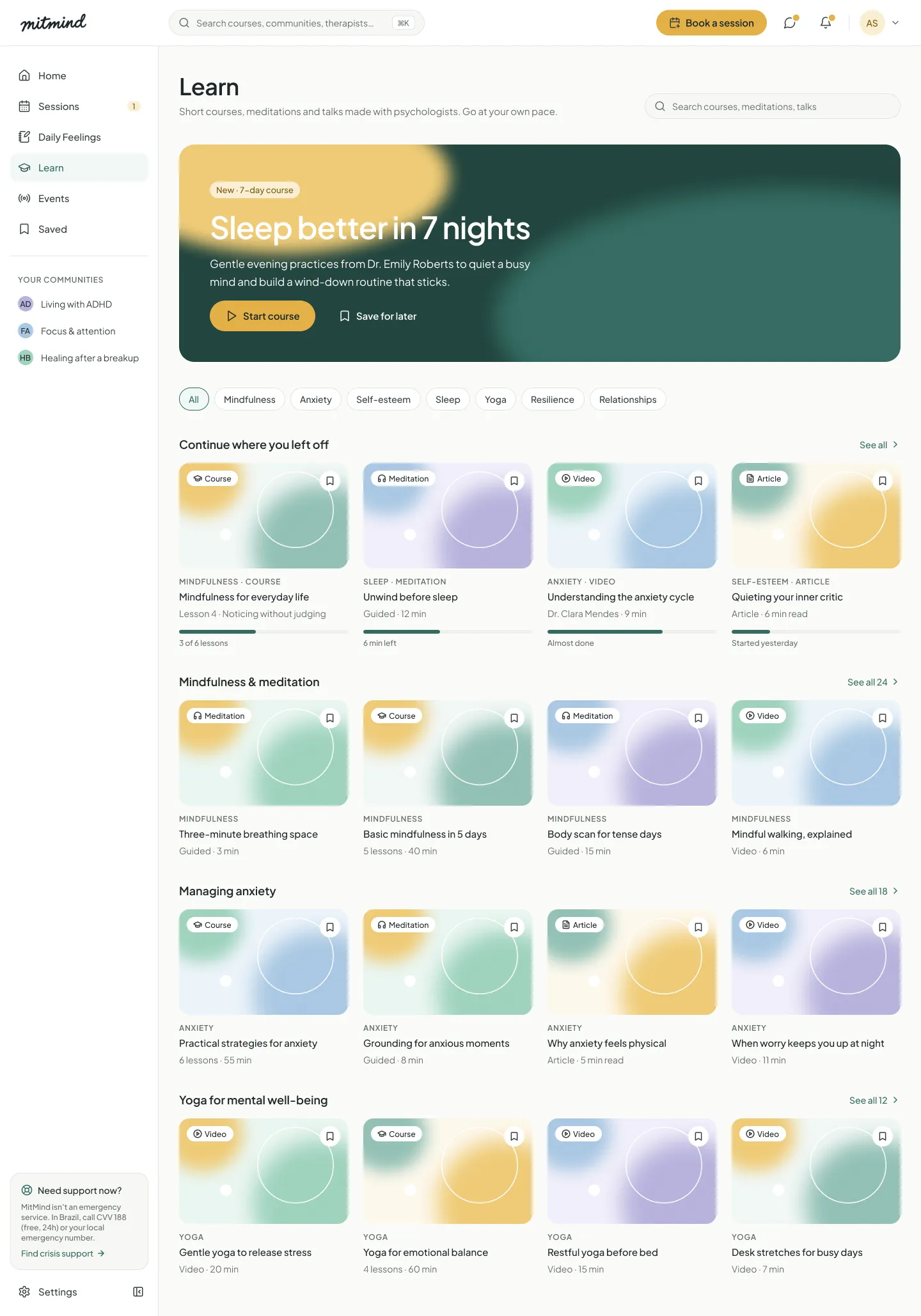
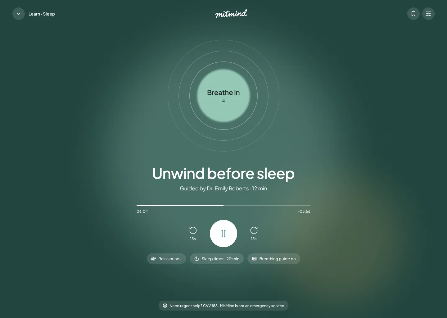
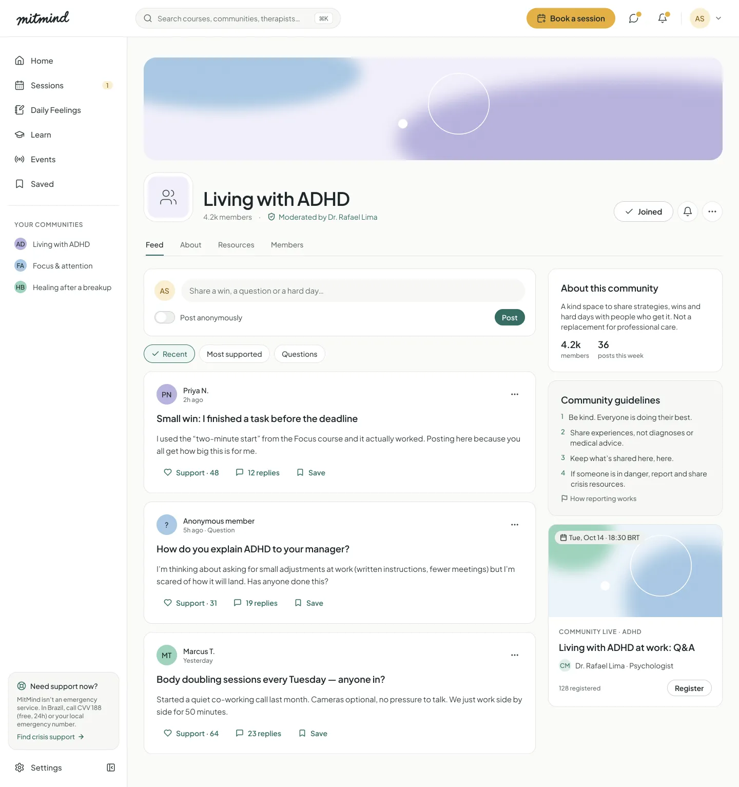
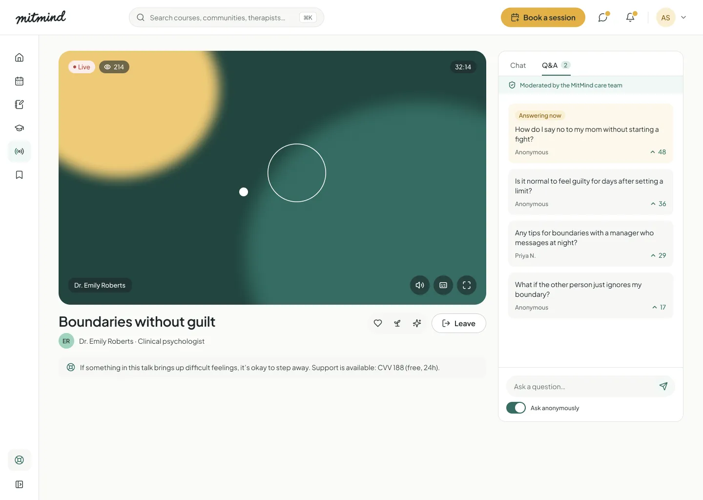
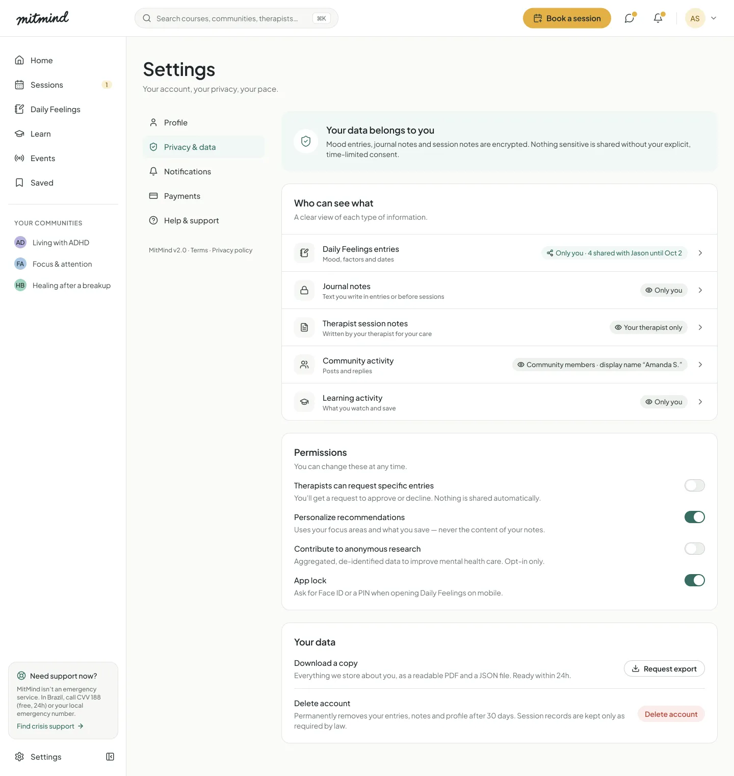
Mobile
The core journey also works on a 390 px screen: check-in, sessions, booking and the meditation player, with a bottom bar and crisis support in the footer.
- Home
- Daily Feelings
- Checkout
- Meditation player
05 · VALIDATION PLAN
How I will measure it
MitMind is a concept and has not been tested with users yet. These are the targets I would track in the first round of usability tests.
Success targets
- < 60 sTo complete a daily check-in with a note
- ≥ 90%Of testers who can say who sees their entries after sharing
- < 10 sTo find crisis support from any screen
- ≥ 80%Of testers who book a session without help
Planned usability test
Moderated sessions with 5 people: 3 in therapy and 2 who never tried it. Results will be charted by task.
| Task | Success criteria | Target |
|---|---|---|
| Log how you feel today, with a note | Done in under 60 seconds | 100% success |
| Share last week's entries with your therapist | Can explain what the therapist will and won't see | 80% success |
| Stop sharing with your therapist | Done without help | 100% success |
| Find urgent help from the Learn page | Under 10 seconds | 100% success |
| Book a session for next week | Done without help, under 3 minutes | 80% success |
| Find a 10 minute meditation for sleep | In 3 steps or fewer | 80% success |
User feedback
No quotes here yet, on purpose. The next step is to test the prototype with real people and add their own words to this case.
06 · CONCLUSION
Reflection & key learnings
What worked, what was hard, and what comes next.
What worked well
- Writing care principles before any screen gave every decision a clear test.
- Building the design system first made 67 screens consistent and fast to produce.
- Designing empty, loading and error states early made the product feel real, not only the happy path.
- Auditing my own v1 showed me how much context changes a pattern.
What comes next
- Usability test with 5 people
- Dark mode tokens
- Tablet breakpoint
- Dev handoff with Code Connect and token export
Challenges & trade-offs
- Warm but clearAvoiding clinical words can make copy vague. I wrote voice rules with examples, so every message is kind and still tells people exactly what to do.
- Privacy versus useful sharingTherapists need context, people need control. Per-day sharing, opt-in notes, time limits and an access log add steps, but each step builds trust.
- Scope13 product areas is a lot for one designer. I finished the core journey with full states first and left dark mode and the tablet breakpoint for later.
Key learnings
In mental health, every small detail carries emotion. A red color, a broken streak or a crying emoji can tell someone that their bad day is a failure. Here, design is also about what you choose not to show.
Privacy is a design material, not a legal footer. When people can see who sees what, and stop it at any moment, they can be honest. The consent screen became one of the most important screens of the product.
Coming back to my own project two years later was humbling. v1 copied patterns from social networks because they were familiar. v2 started from a different question: what does a person need between sessions? Changing the question changed everything.